Designing for impact: helping women with daily discomfort, Unload App
■
■
■ ■
Overview
A significant number of women often experience discomfort, which can manifest as a range of unwelcome emotions or a feeling of being down during the day. This topic is relatable to many individuals, yet the experience of discomfort varies greatly among them.
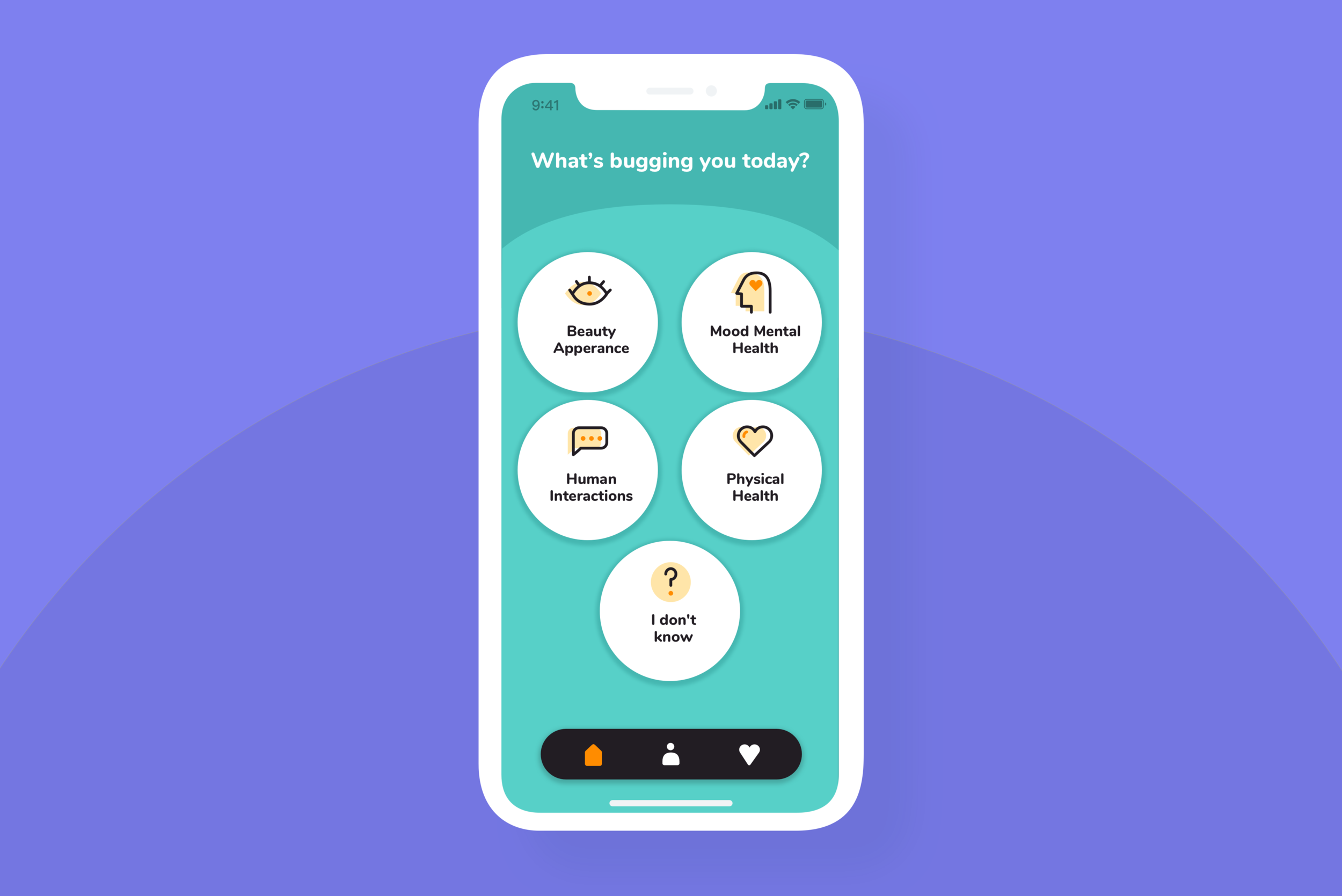
By investigating this area and being open to research findings, we aim to provide a solution to alleviate discomfort and improve overall well-being and mental health. With this objective in mind, we have developed the app "Unload" specifically for women to alleviate discomfort and improve overall well-being and mental health.
Role
UI/UX Designer
Tools
Sketch, Figma
Duration
3 months
Responsibilities
User research, synthesising
research insights, creating empathy maps and journey mapping, jobs to be done, ideating solutions, wireframes and visual
design.
Product Thinking
■
■
■ ■
Defining business
The business needs to introduce range of products that would answer self-consciousness, societal impact on body image and well-being of woman to gain their engagement.
Defining a user need
A user needs help with managing their discomfort levels, body imagine issues and their daily self-consciousness in order to improve their well-being every day.
Insight
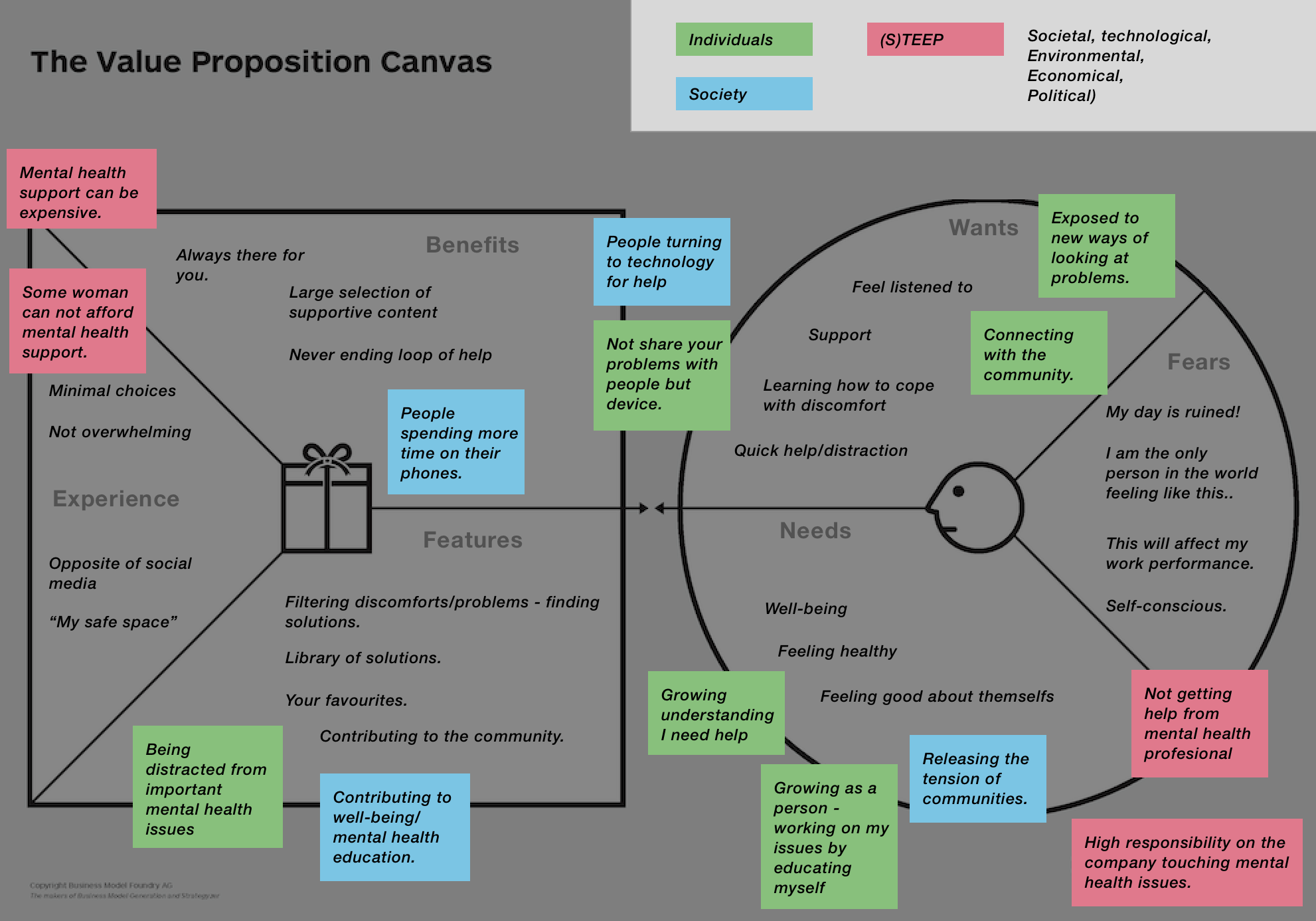
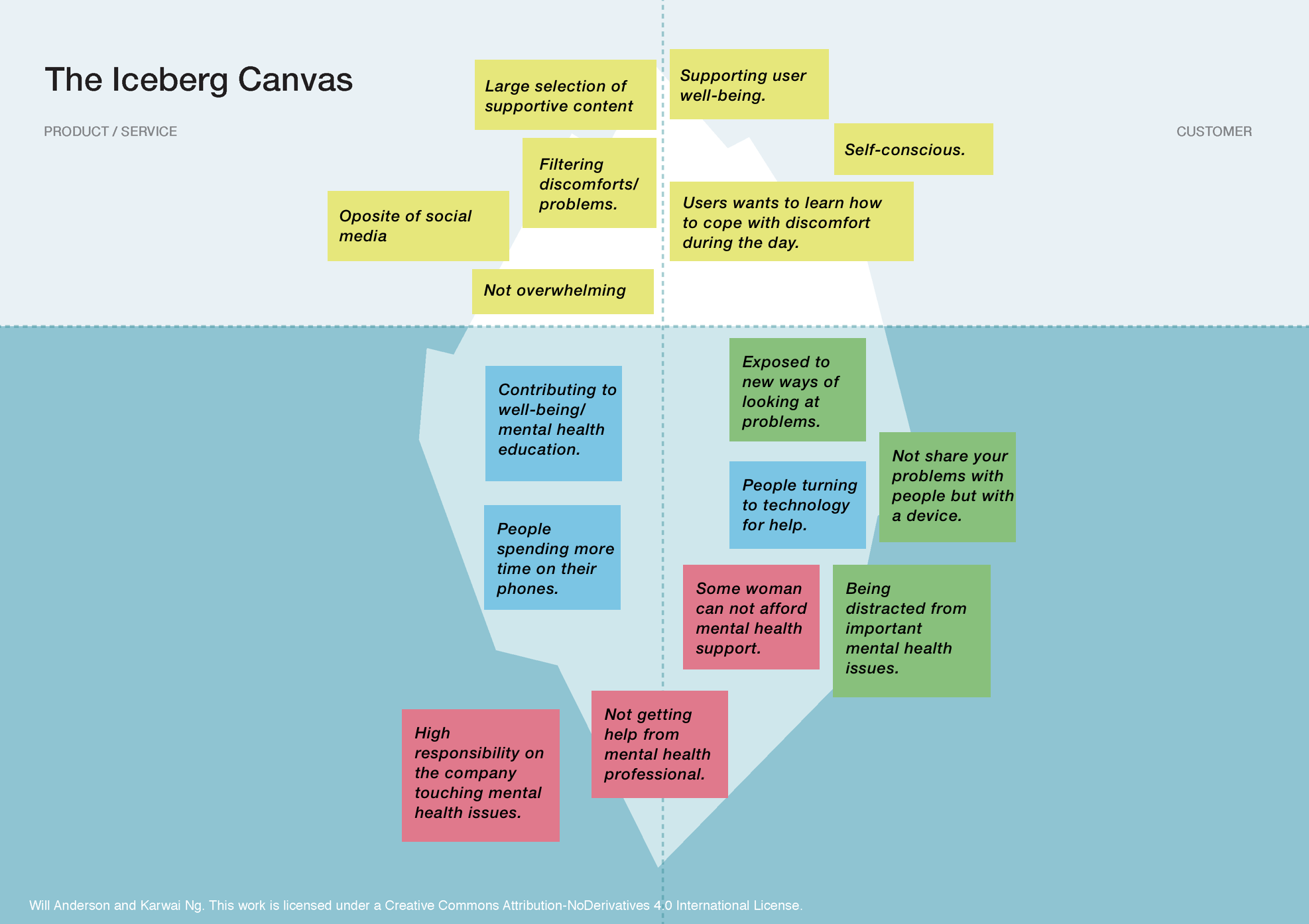
Key four areas of focus based on the Iceberg Canvas:
01 | Users want to learn how to cope with discomfort.
02 | The solution can offer library of supportive/educating content.
03 | Some people can not afford mental health.
04 | There is a higher responsibility on companies connected to metal health strictly.
05 | People are spending more time on their phones.
Questions that would lead us during the Double Diamond process:
01 | We need to understand what’s the mechanism behind women discomfort.
02 | Does daily discomfort is strictly connected to mental health or maybe more well-being?
03 | How can we make users start with our solution but end without using their phones?
Problem and process
■
■
■ ■
Understanding
How to help woman ease their moments of uncomfortableness during the day. By approaching this problem space as open as possible I decided to focus on few hypothesis that would give us a bigger area to explore and lead to key issue.
Assumptions:
■ Women experience discomfort lightly.
■ Moments full of discomfort don’t have a big impact on their days.
■ Women would like to be entertained in those moments.
■ Women usually share it with other people by text/funny memes.
Hypothesis:
■ If women would be entertained during their discomfort, then they would get distracted and forget about the discomfort.
■ If women would share moments of their discomfort with other people then they would feel the support and feel a bit better.
How do we know this idea is the right one?
01 | What people problem am I trying to solve?
I want to understand how women daily discomfort contributes to their mental health and body image.
02 | How do I know it is a real problem?
Women have lower BMIs than men, a lower incidence of being overweight. However, women across all weight categories are more dissatisfied with their bodies.
03 | How I will know it’s a success?
Getting positive feedback during user tests of the prototype.
Triple Diamond Framework
Exploratory research
■
■
■ ■
Study goal:
Finding out what women feel during moments of discomfort and how they cope with it. Comparing different forms of research (like Survey/Individual Interviews with Video Diaries) brought contrastable findings.
01 | Survey
■ Survey conducted to collect information about the behaviours, needs, opinions and reactions of our wider target group.
■ Finding users: female facebook groups connected to well-being, self-care, mental health etc.
■ Participants: 150 answers collected during 2 weeks
02 | Video Diaries
■ Conducted to understand how our targeted users behave at the moment of discomfort and what they feel and say.
■ Participants: voluntary participants signed up during the survey process.
■ 6 users recording video diaries daily during 7 days.
■ At the end of the process conducted Individual Interviews with each user.
03 | Individual In-Depth Interviews
■ Conducted to collect information about the behaviours, needs, opinions and reactions of our target group during in-depth interviews.
■ Finding users: voluntary participants signed up during the survey process. Interviews were conducted remotely across one working week.
■ Participants: 10 users
04 | Existing Research
■ “Understanding Body Dissatisfaction in Men, Women, and Children” by Sarah Grogan
■ Natalie G. Stern, Renee Engeln. Self-Compassionate Writing Exercises Increase College Women’s Body Satisfaction. Psychology of Women Quarterly, 2018; 036168431877335
Summary
Key Survey Findings
01 | 74% of participants expressed they might be interested in sharing this moment with and unknown woman dealing with the same issue.
02 | 71% of participants expressed their level of discomfort was mostly between 5-8.
03 | 72% of participants expressed they sometimes share those moments with their friends
Video Diary & Think/Say Findings
01 | Video diary
■ 70 % participants didn’t like recording their face in those moments
■ 100% mostly felt uncomfortable in the mornings
02 | Think&Say
■ What users think is that they mostly feel sad during the moments of uncomfortableness but what they say in the moment of discomfort is usually feeling mad, angry and disappointed.
■ What users think is usually mostly making then feel discomfort is their visual appearance but what they mostly say during the moment is their Mood & Mental Health.
Define
■
■
■ ■
The job changes - depending on the state of a user and the situation she is in. For example having puffy eyes is different from feeling down after a tough day.
| Comforting
When I’m feeling uncomfortable I want to be comforted so I can feel better.
| Quick Fix
When I’m feeling uncomfortable I want to be distracted so I can move on.
| Sense of Community
When I’m feeling uncomfortable I want to belong somewhere so I can feel better.
User flows
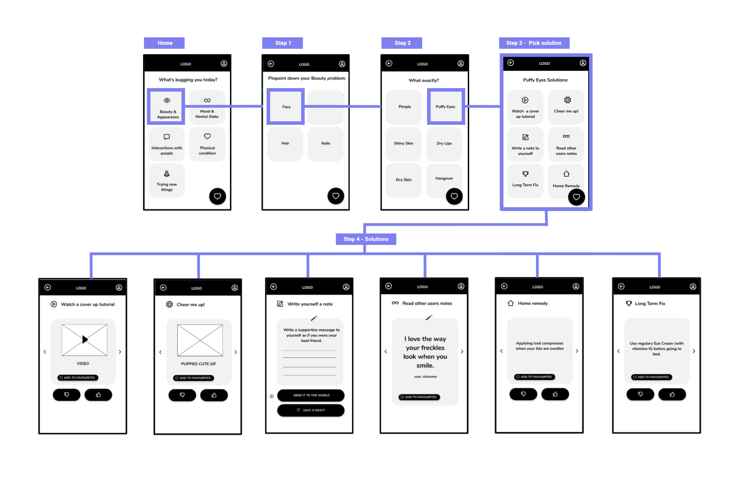
As a key user flow I decided to focus on exploring a path where the user is having a visual appearance (beauty) problem.
One of the key findings form the user research was to discover that Mental Health and Visual Appearance were the most mentioned issues during the interviews, daily diaries etc. While deciding which one of those two problems to pick I reevaluated the research findings - I understood that users were more open to talk about their Visual Appearance problems which led me to focus on this area.
User flow - Start at “What’s bugging you today?”
Prototype testing & iteration
■
■
■ ■
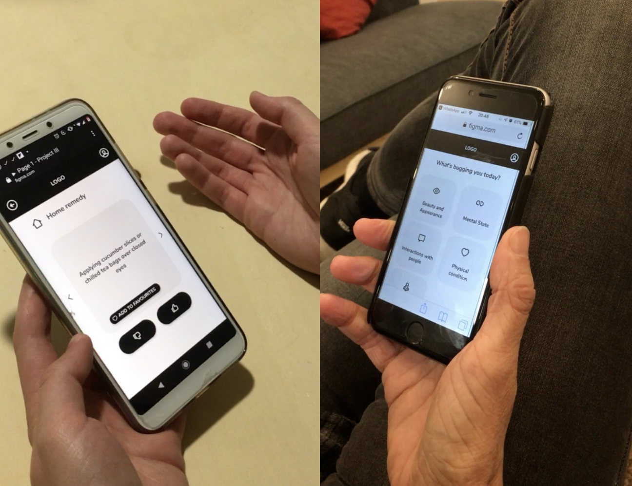
Testing: Round I
During this testing I wanted to find out if users followed the path and will find a solution to their beauty problem. Usability testing was conducted with 10 users. 8 of the users were tested in person in moderated usability testing and 2 of them were tested remotely. Each testing took between 20-30 minutes.
User goal:
Find a solution for users’ discomfort.
User task:
Imagine that you woke up with puffy eyes and you want to find a solution for it.
Tested path:
Beauty&Appearance > Face > Puffy Eyes > Pick solution > Each solutions
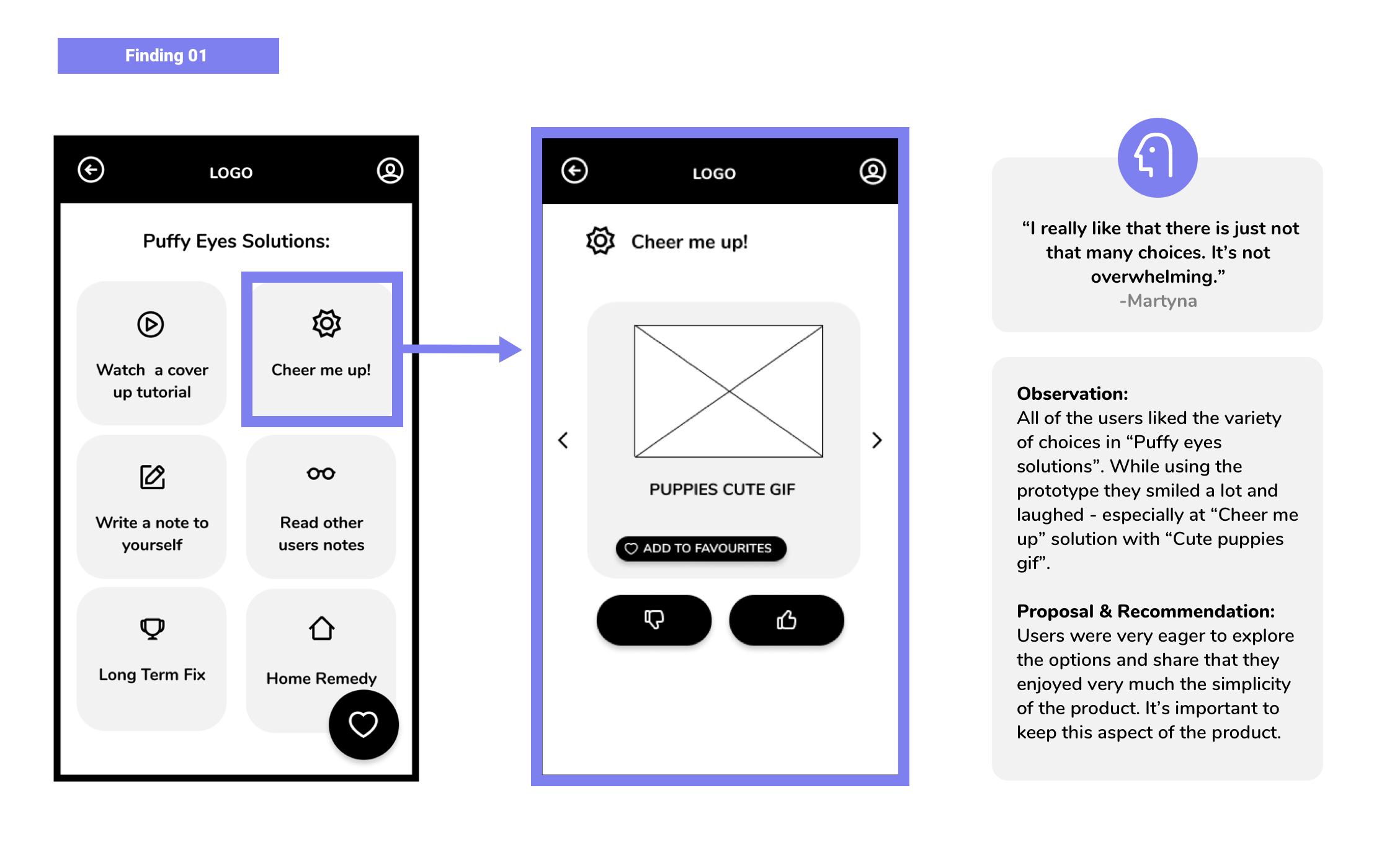
4 key findings from testing Prototype I
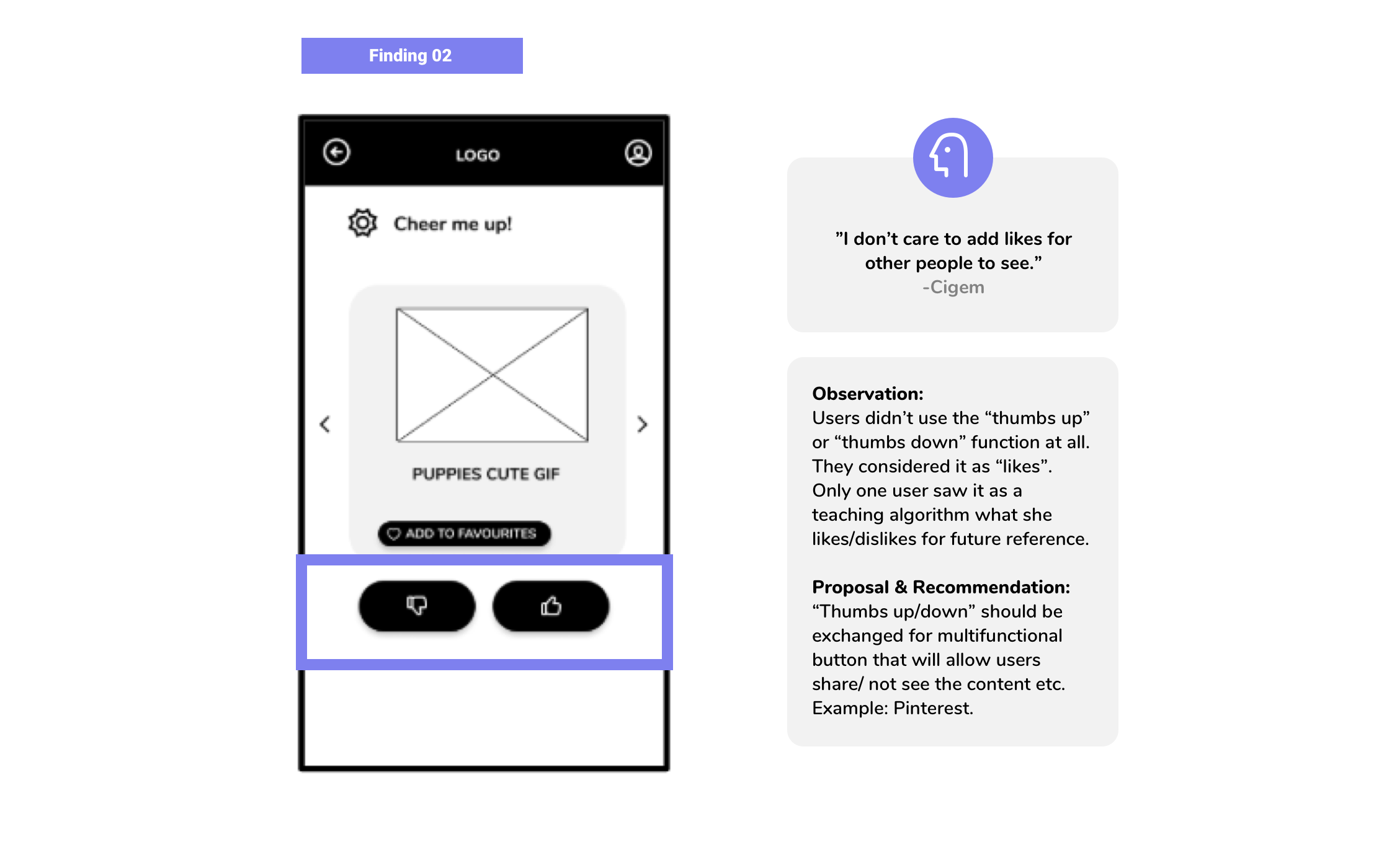
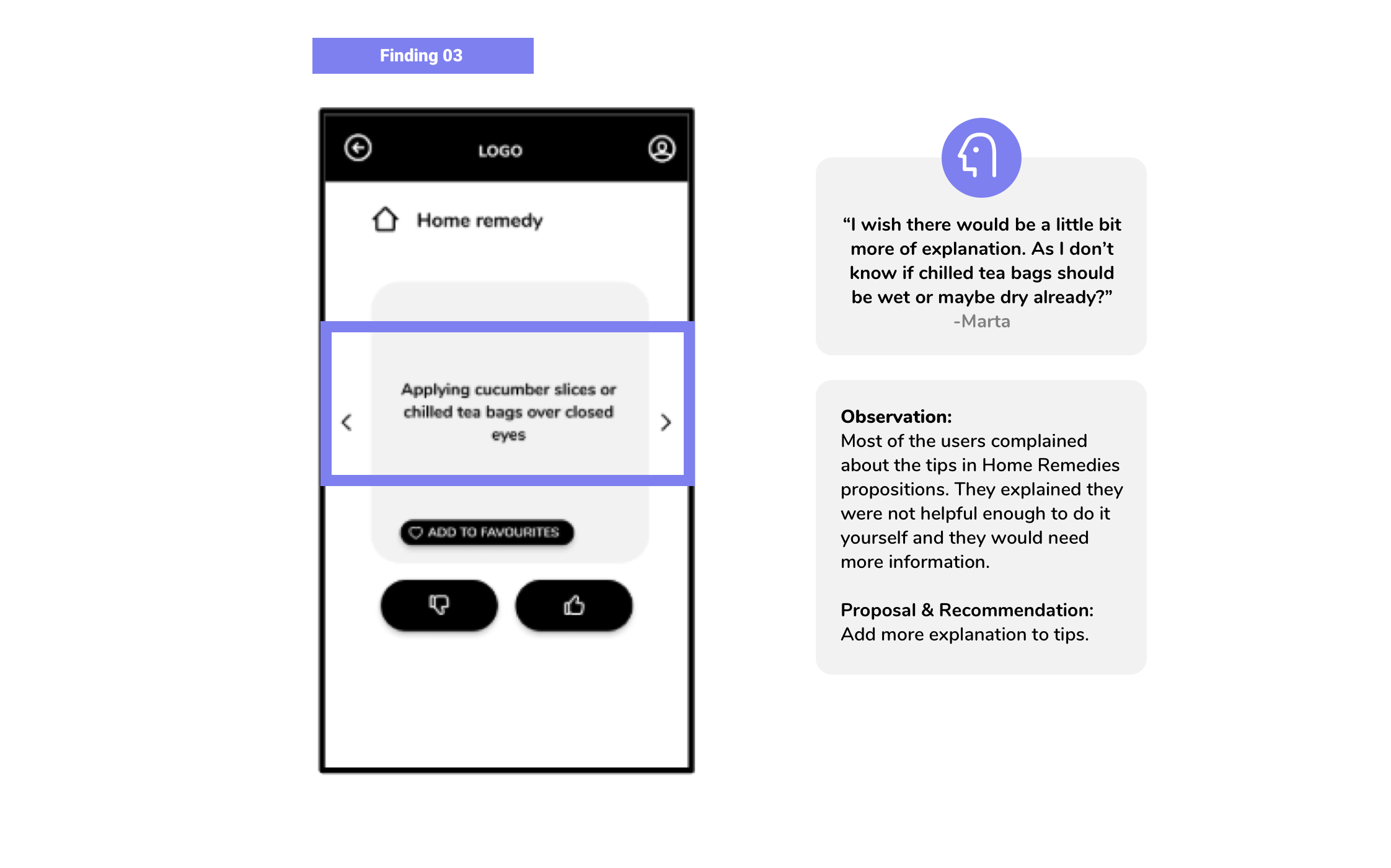
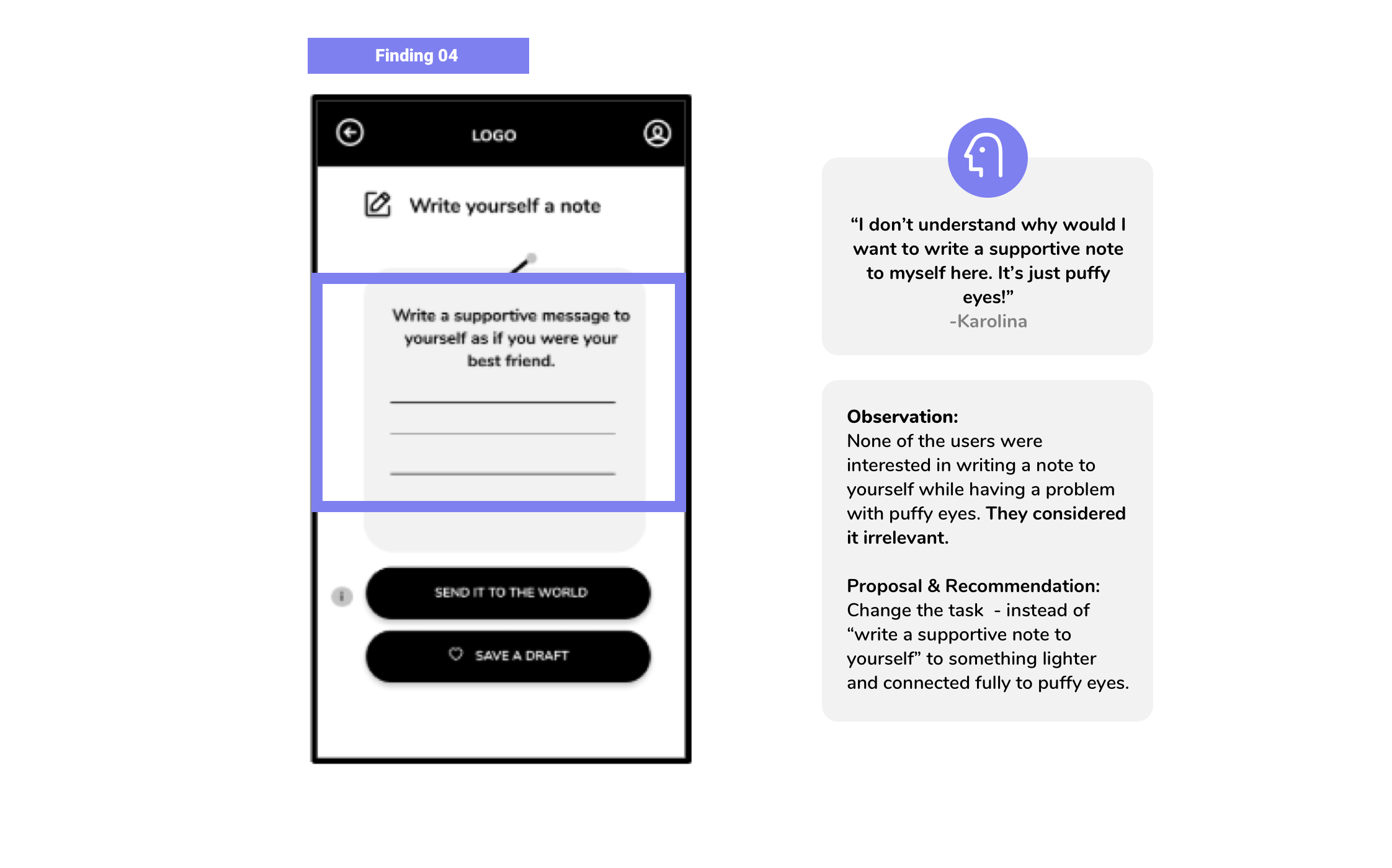
Testing: Round II
During the second testing I focused on improving the already existing path of a beauty problem and adding another one connected to mental health.
Mental heath was one of the most mentioned issues during the research along with visual appearance. Considering that the focus in the first prototype was directed on visual appearance issues it felt that there is still room to add the mental heath path to the second prototype and test those two improved paths during the testing.
01 User Task:
Imagine that you woke up with puffy eyes and you want to find a solution for it.
02 User Task:
Imagine that you woke up and you feel sad. Find a solution for it.
Second task improved by findings from testing: Mood & Mental health > Sad > 1-3 (any choice) > Pick solutions > Each solution
Summary of findings
The second round of testing reinforced the positive feedback received in the previous testing, specifically the Mental Health path was highly valued for its ability to aid users in identifying their feelings.
Users were unaware that clicking on the logo would direct them to the home screen. This was determined to be due to the visual pattern and positioning of elements being borrowed unconsciously from web mobile patterns. This will be corrected in the next iteration of visual design.
Testing participants positively received the feature of naming and rating the intensity of their feelings. It was noted that this feature helped them to take a step back and evaluate their emotions, particularly when they found themselves becoming overwhelmed.
Visual design
■
■
■ ■
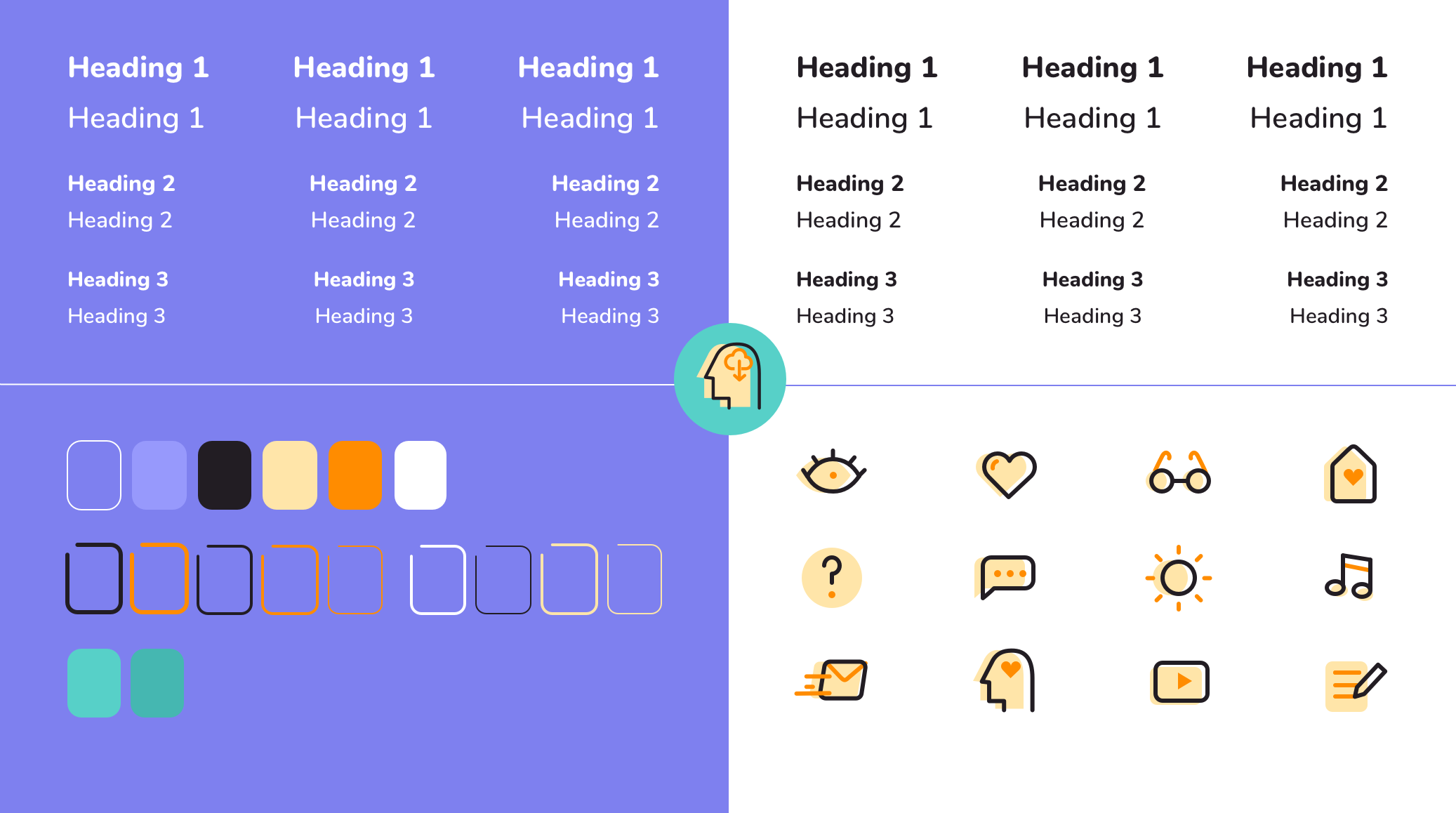
Main goal: the visual design should be playful and create a safe environment for women. Should be inviting and simple.
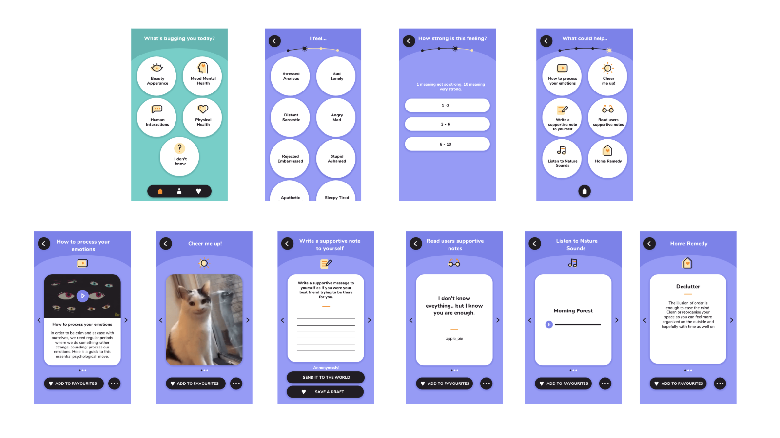
The key findings from the user testing of Prototype II were incorporated and addressed during the visual design process, including adjustments to navigation to conform to mobile app standards and solutions in the "What Could Help" section for mental health issues.
UX Design App MVP Flow
Reflection: hypothesis
■
■
■ ■
Hypothesis I
If women would be entertained during their discomfort, then they would get distracted and forget about the discomfort.
This hypothesis has been validated. As I found out there are three different user needs and one of them fully confirms that light discomfort can be exchanged by some kind of form of entertainment like watching videos/gifs. What’s important is a curation of that content and as well thinking about ethical consequences or distracting people from their emotions long term (as we know based on leaked research papers from Facebook).
Hypothesis II
If women would share moments of their discomfort with other people then they would feel the support and feel a bit better.
This hypothesis has been validated. As I found out there are three different user needs and one of them fully confirms that contact with people that went through the same problem can offer support to the users.
Take-aways:
01 | The visual design concept is an assumption that this specific visual language would make users feel playful and safe. A separate usability testing would need to be performed to confirm and understand this issue.
02 | UI elements even though very similar to the prototype at the end are different so it would be very important to see if they have any usability problems.
03 | In the prototype there were only two paths tested. The whole solution - the app has more to it and to fully understand this experience it would be needed to design it all and test each of them.
Case Studies
☻
Case Studies ☻
Expressing classical music through a website
UX Design | Web Design | UI Design
Mic library based on testing competitors products
UX Design | Web Design | UI Design


