Mic library based on exploratory research of competitors products
Micpedia is a library based platform for researching microphones. The aim of this website was to create a place for music industry professionals, semi-professionals and hobbyists to educate them on microphones. In the future this website would transition into e-commerce while keeping the library and all the features helping users to make more educated purchases.
Stakeholders
Project Manager/Owner, Art Director, CEO, rest of the team.
Role
UI/UX Design
Tools
Sketch, Figma
Duration
3 months
Responsibilities
Scheduling users and conducting remote moderate usability testing. Analysing findings from user testing and translating them into information architecture and wireframes. Designing the user interface while taking into account mobile, tablet and desktop. Working closely with dev team to express how the website should move and work in detail.
Design a responsive web library for microphones based on the clients data source.
Client owned a data source of the mic library and had an assumed image of the users of the portal - professionals, semi-professionals in the music industry and hobbyists buying for recreational use.
Unfortunately there was no budget for user research, considering the situation I was able to convince them to run short usability testing on their direct competitors’ websites to have a base for design decisions and as well possibly express the value of user centered design to the client.
Triple diamond framework
01 | Discover
Usability testing on competitors products. Understanding findings.
02 | Define
Creating success metrics and golden path.
03 | Design
Sketching solutions.
04 | Deliver
Deciding on direction of the solution.
Exploratory research. Testing focused on two potential competitors of the platform.
Usability testing was conducted with 10 users. It was conducted fully remotely and each testing took between 30-40 minutes. Ratio of users: 4 users - music industry professionals, 3 users -music industry semi-professional, 3 - hobbyists/novice users.
Goal: How easy it is to research the microphone with a specific need.
Task: Imagine that you are planning to start a podcast. Try to find the right microphone for this purpose under 2000 euros. (The goal for this specific task was to engage someone who is a professional but as well someone who is a novice user.)
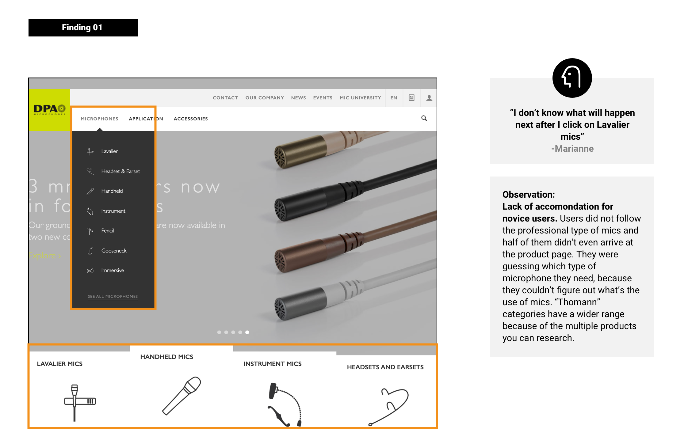
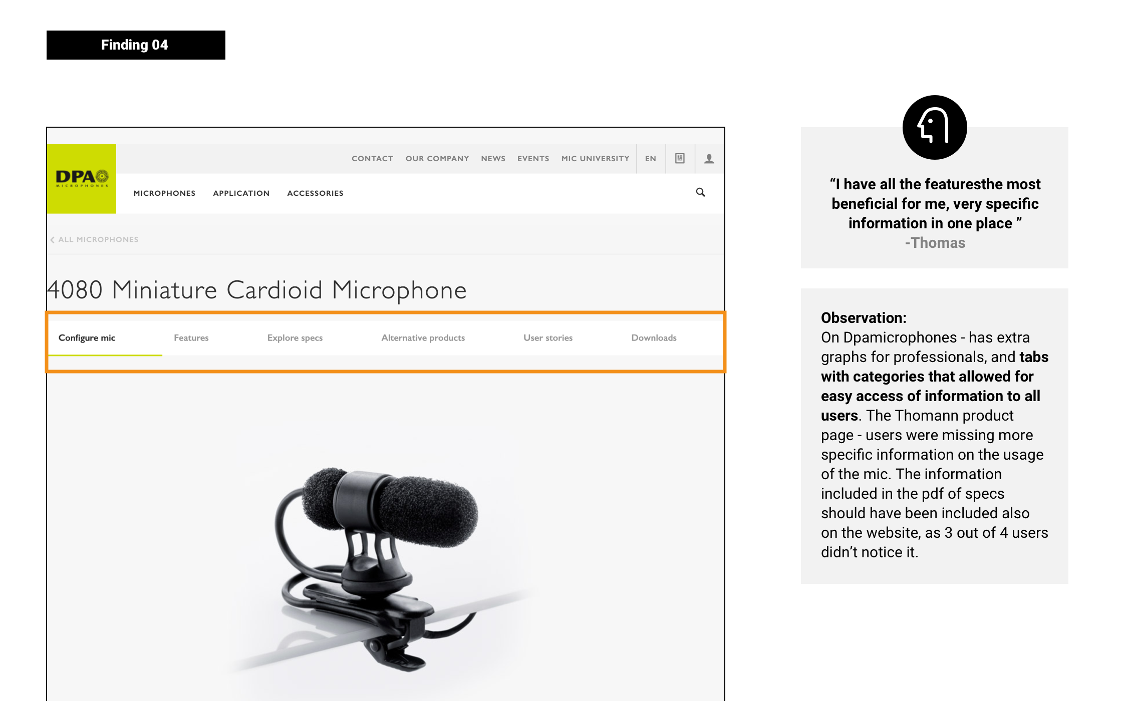
DPA Microphones | This website uses mostly advanced users terminology, by testing it I wanted to understand at which point novice users would struggle. This website is cleaner and more modern visually compared to the Thomann website. By testing it I wanted to understand if this specific visual design is something that works for this group of users.
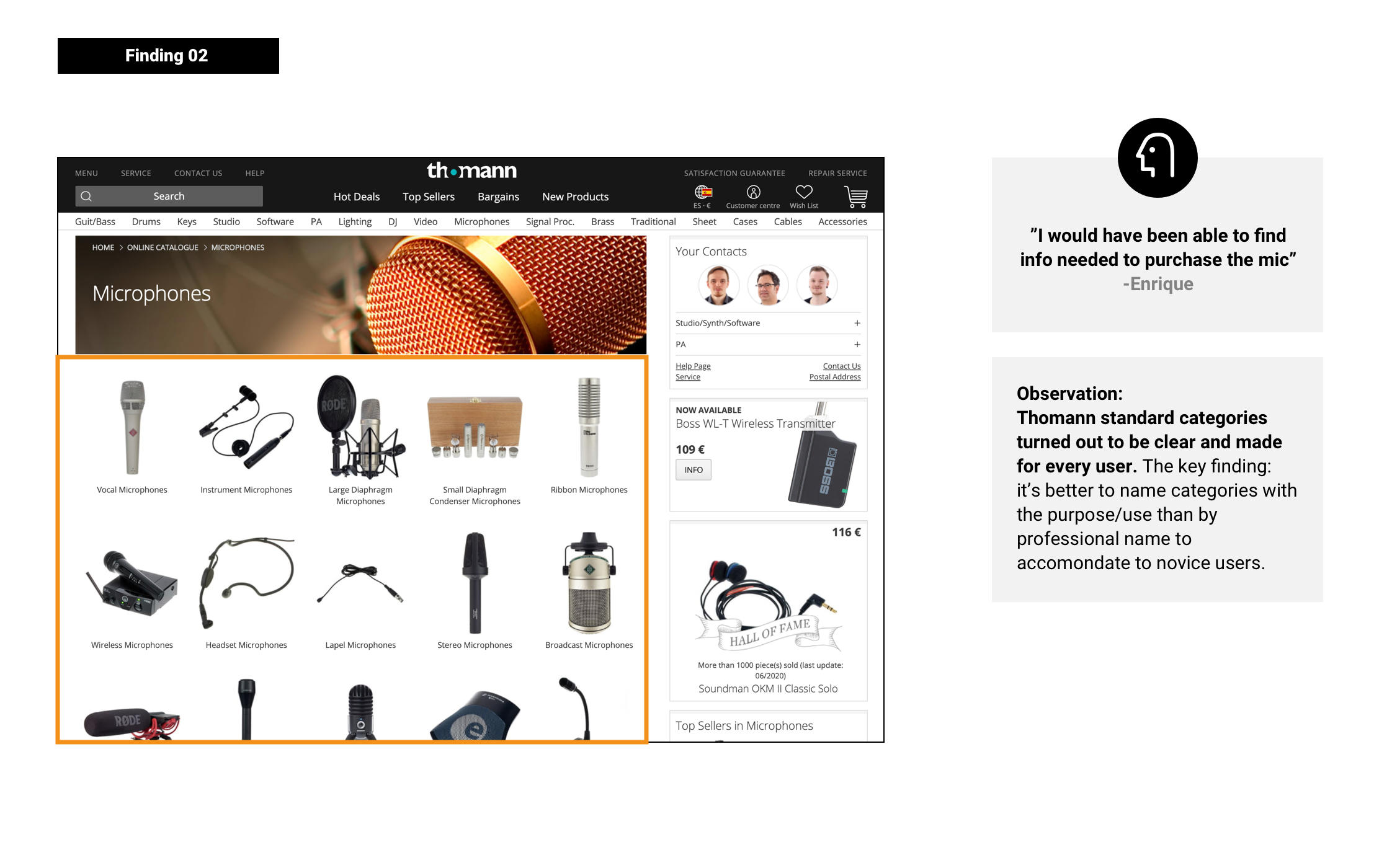
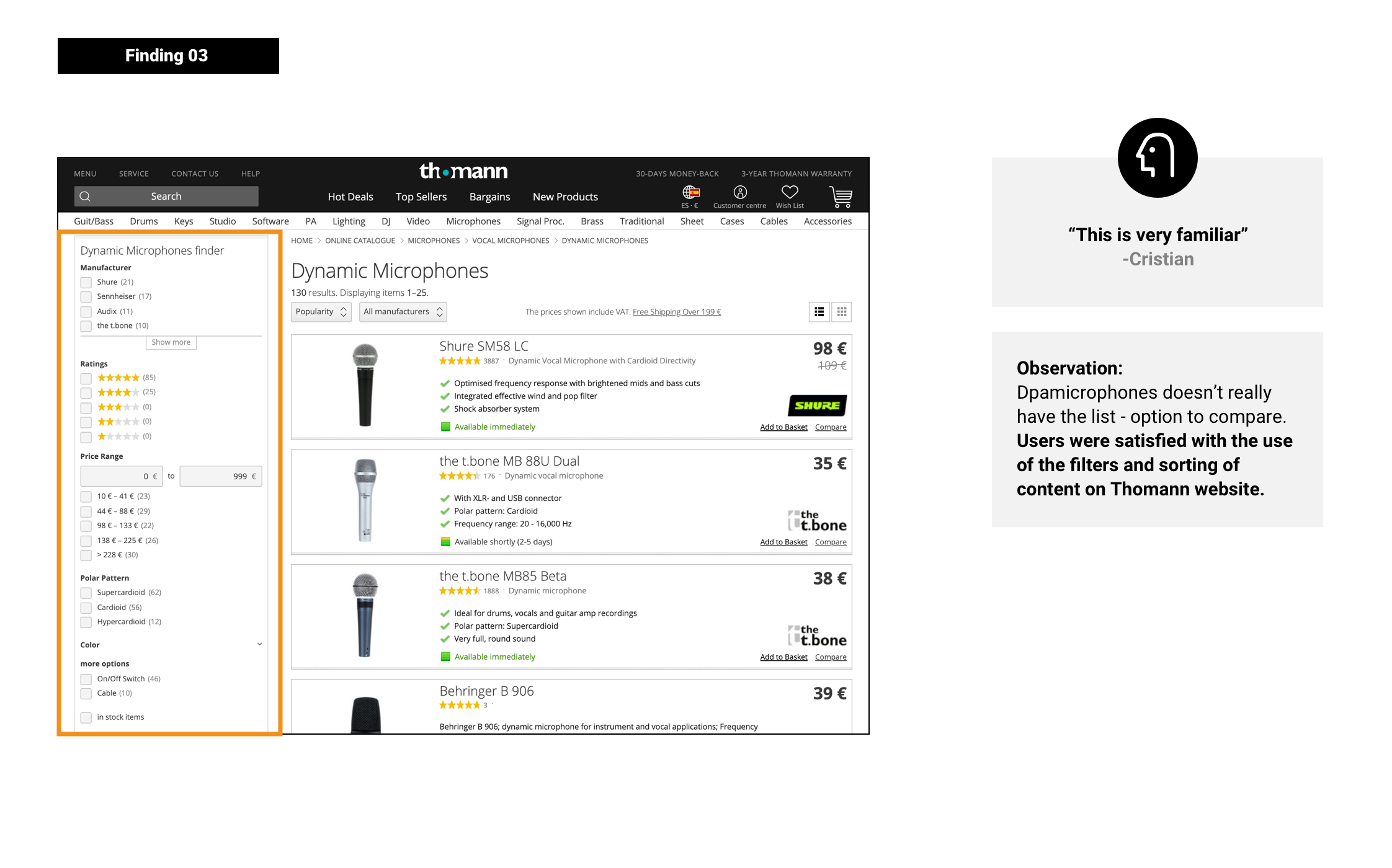
Thomann.de | Thomann is a visually outdated website but still everyone in the music industry knows this one. I was curios to test it because of the typical categories pattern. Additionally the process of comparing products looked interesting.
Key findings


Insights
Presentation of microphones categories by usage and function for semi-professionals and novice users would be recommended. Professionals usually use search because they know the item they are looking for.
The list of the products is an important part of comparing and filtering - less advanced users highly appreciate it. We should add the option to filter “by specific type of use”.
The Product Page could be very similar to the DPAmicrophones page as it has a lot of details that can be accessed from the one point-tabs. This would allow advanced and less advanced users to find what they need. On the Product page we should highlight the use of the product and price. It should be very visible.
Success metrics
Professionals and semi-professionals are the most potentially profitable group for this platform and it’s development. While creating success metrics and picking the golden path we focused on the area of:
Microphones lists creation
Total amount compared with how many of those lead to registrations.
Increasing website registrations
Time-on-task (of the login flow)
User error rate
Golden Path
Golden Path for professional/semi-professional users.
Implementing key findings from testing to the product.
In the examples below I will explain the path of a few elements that seemed the most crucial in the context of previous usability testing I conducted and the findings.
The process of creating the final wireframes took multiple revisions as this was a way for the client to understand their needs as some of those parts were not fully specified in the brief.
Key problem to solve was giving opportunity to the semi-professionals users and hobbyists to search by use on the home page which was one of the key findings from the testing. The final wireframe included the bar of filtering by use which took less space and will allow even a mobile user to search by use.
Final wireframe (desktop, mobile) on the image on the left.
Another key area I wanted to implement based on the findings from the user testing are tabs on the product page. This way we wanted to give the opportunity to advanced users to have access to all the needed information by categorised content in tabs.
On mobile after scrolling tabs would be sticky to the to of the top of the screen and this way we would allow the user to not loose possibility to switch between them. In case the content would be too long in tabs, tabs would need to be slideable to the sides.
Client wanted to emphasise the brands of the microphones more than the common filters.
Considering I already used filtering on the home page I decided to follow with the same pattern and use this filtering bar for the brands as well.
This design needed to be adjusted to the mobile version. In this case making a separate page with all the filters made more sense. Separating and highlighting brands on mobile could cause unnecessary confusion. That’s why I decided to included them with all the other filters
Visual Design
Internal revisions
During the internal revisions I wanted to explore visual possibilities and explore the navigation design while discussing it with the art director. In my work flow I usually don’t overthink the wireframes. From my perspective I always try to develop the purest form of information architecture that would give me a base to work during developing the visual design. I treat it as a direction but as well I am not afraid to make bigger steps to explore other possibilities.
In this specific scenario the navigation I designed in the wireframes had two 4 groups of information. I understood at that point that probably during the visual design I will need to re-design it in a way to give the value to the most important areas for our client from his business perspective.
Internal proposal
In this proposition I was experimenting with positioning of “search by use filters” vertically and how this could work. Visually I was going for a very “oldschool tech” feel focusing on dark greys and playing with them.
After discussing it with the Art Director I understood that this vision is too dark and not that approachable for hobbyists. We decided to focus on “warming up” the image of the brand and making it feel more modern and simple. The vertical filters were far fetched considering the vertical content next to it. The groups of information in the navigation worked pretty well.
The key goal for presenting it to the client is approaching the music industry products from a less technical point of view. We wanted to warm up their image by using warm greys and gold.
Prototype presented to the client - designed in Figma.
Results and takeaways
The key takes-ways from finalising the design phase:
The conducted usability testing was a very important step for this project for several reasons. First of al it gave me a direction for making better design decisions but as well it helped to educate the client on their users needs.
In a perfect scenario I would love to have more time for conducting short interviews and later on test the wireframes and visual design as this product is introducing a few “new” concepts to their audience. Unfortunately it wasn’t possible and at the end I am glad I could make make a small change for this specific product while advocating for their users needs.
Helping women with their daily discomfort
UX Design | UX Research | Strategy
Redesign based on existing design system
UX Design | App Design


