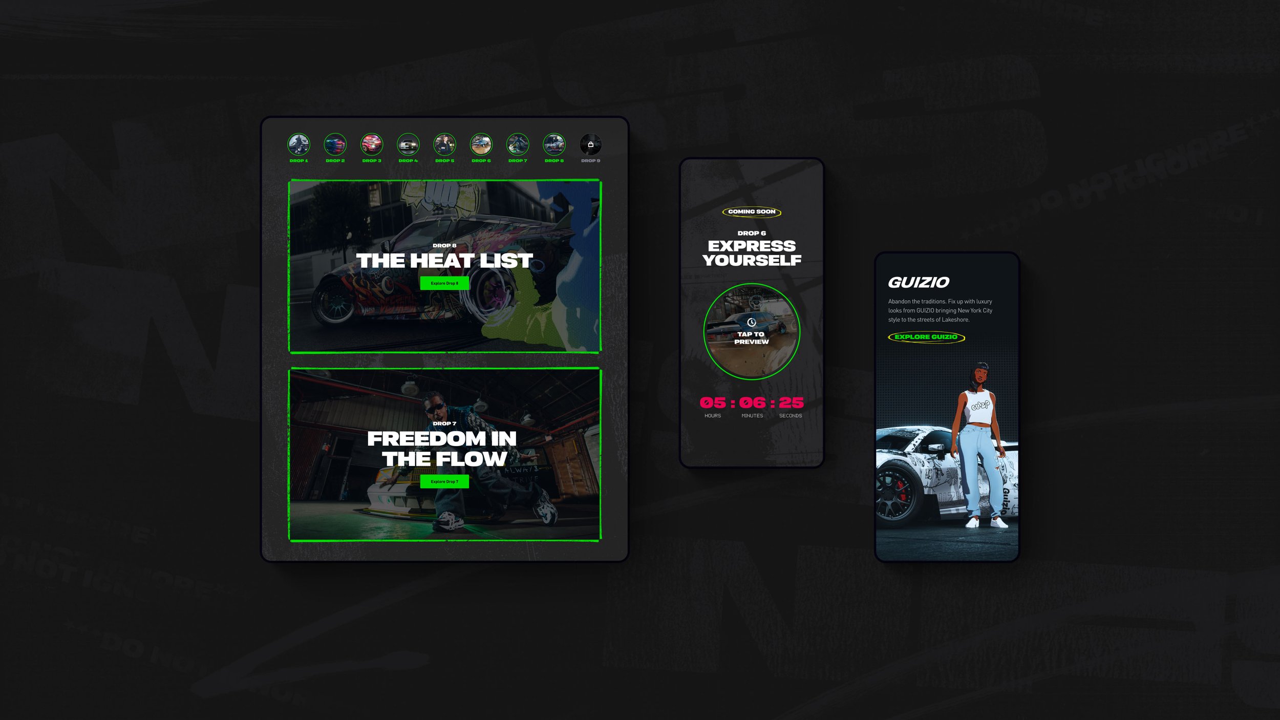
Need For Speed Unbound: Lane Changers Club, cultural hub for the game release.
■
■
■ ■
Overview
The challenge was to reposition Need For Speed as more than just a racing game and cater to the core fans while engaging a new segment of gamers influenced by hip hop with the newest version Unbound.
Result
The solution was to design the web experience for the cultural arm of the NFS franchise called the Lane Changers Club, showcasing news in NFS activations with fashion partners, musicians, and artists. The campaign was built in a 9 week drop schedule, revealing one unique topic per week leading up to game launch, which continuously built hype and resulted in a robust content destination for fans to find the latest features and news from EA partners and creators.
Role
UX Designer
Tools
Figma
Duration
3-4 months
Company
North Kingdom
Responsibilities
Designing wireframes, iterating on the design, presenting concepts to client, working closely with EA web team and internally with multidisciplinary NK team working on a project (UX designers, Visual designers, Project Manager, developers), supporting dev and designers during production
Process & Timeline
■
■
■ ■
When I joined the project, we had already completed the discovery phase and had moved on to the UX Definition phase. However, due to a change in the project brief, we needed to redesign the concept to incorporate the client's available assets. The initial concept involved sharing drops of content with the audience every week for nine weeks, but we needed to adjust it to accommodate the smaller amount of assets. The new brief objectives included:
■ Objective I
Establish the Lane Changers Brand initiative from NFS web
■ Objective II
Always showing latest content first whilst all drop content is accessible
■ Objective III
Content per drop is more limited but leverage assets for the LCC as hub of cultural drops & news
■ Objective IV
A scalable experience which supports post-launch engagement
Definition phase
■
■
■ ■
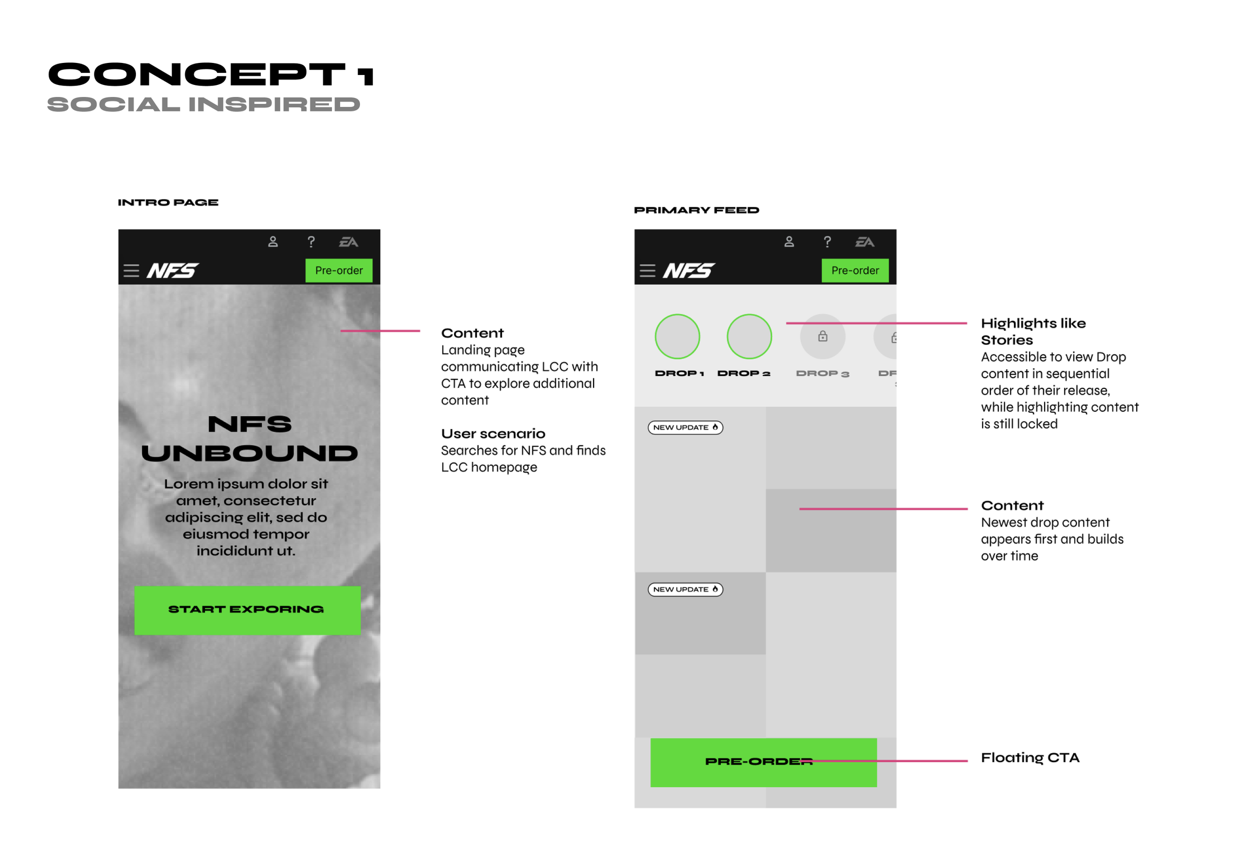
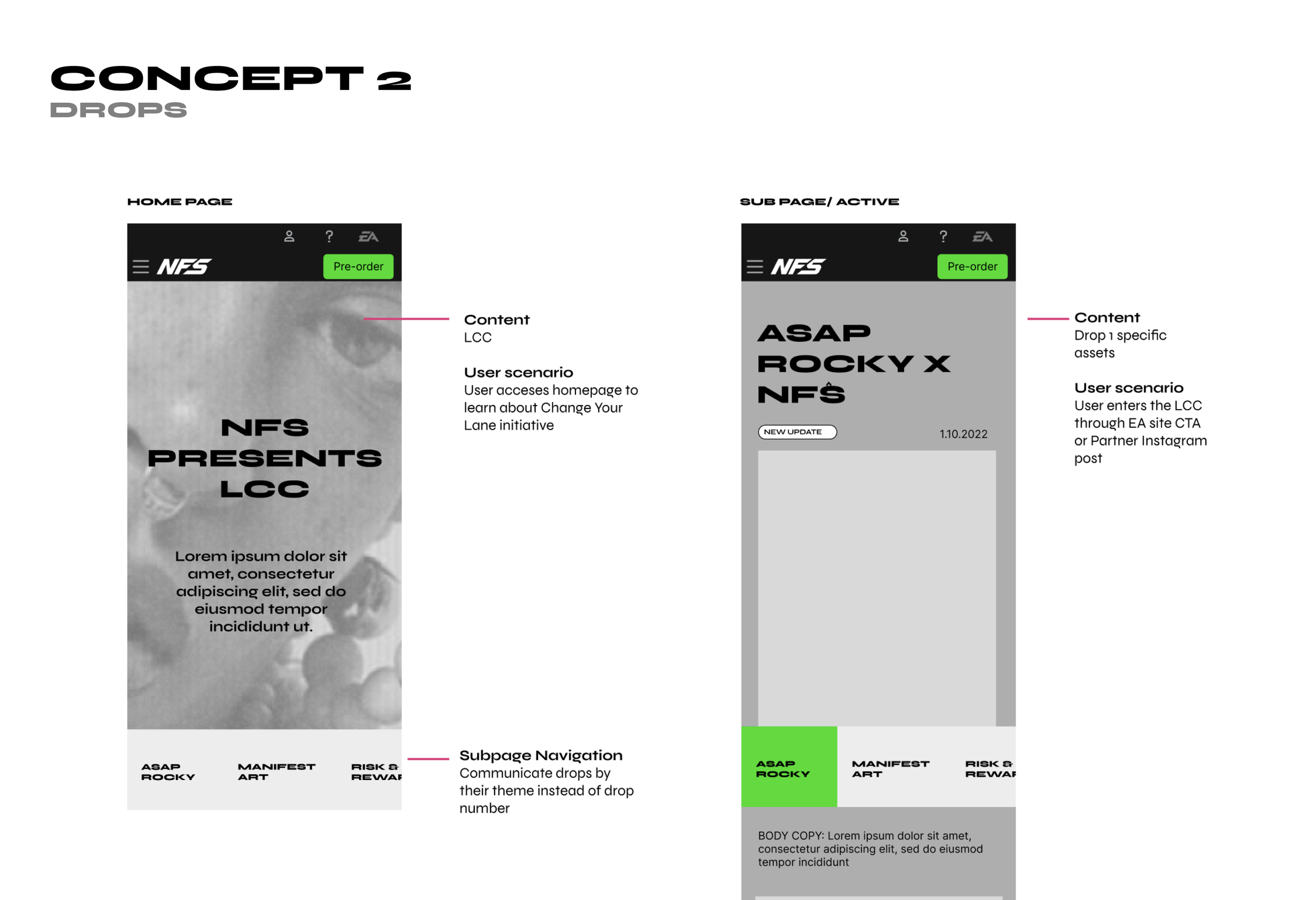
I collaborated closely with another UX Designer, and together, we developed three concepts that addressed the new project objectives with a mobile-first approach.
Concept I
Our focus was to deliver an engaging experience where assets released each week (for 9 weeks) would build a wall of content that users could interact with. We used mental models borrowed from social platforms that utilized stories and walls of content, which users are familiar with. This is a concept that I was responsible for.
Concept II
Our concept follows the drop timeline, which includes a clear campaign structure that coincides with EA site drops. We achieved this by including a slideable bar element present at all times on the home page that would allow the user to access the drop quickly.
Concept III
Our objective was to change the perspective of how we present content by categorizing it through various categories such as cars, fashion, music, and art. To achieve this, we proposed a solution of moving away from drops of content, which could help in case the client was unable to provide enough assets each week.
Defining the concept
■
■
■ ■
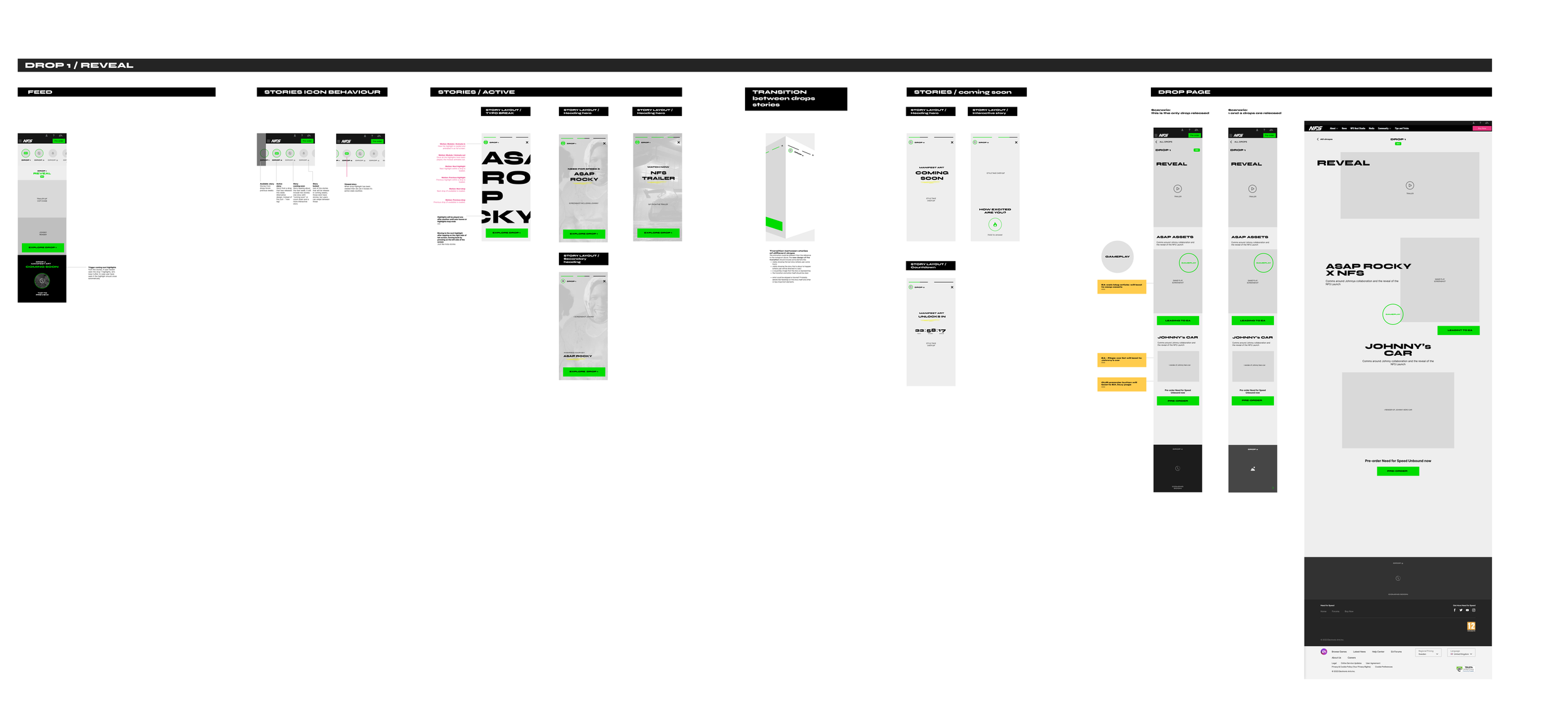
The social-inspired concept that I designed was the one the client liked the most, and we moved forward with it. I was responsible for the mobile wireframes during the UX production of the entire concept. Below is the site map of the whole experience, and the key locations of the platform were:
■ Home
Entering the experience. Was linked with EA website.
■ Feed
Feed of content that would highlight each week drop of content presenting different aspects of the campaign like fashion or music collaborations.
■ Stories
By utilising already existing element like stories we had a chance to communicate through them drops of content that are coming next but as well guide user though those already available.
■ Drop Pages
Per each week we had a separate drop page that contained different aspects of the campaign from fashion to music and art.
9 Weeks, 10 Microsites
During the whole period of the campaign of 9 weeks we proposed a solution highlighted in the sitemap where per each week we would have a Drop page dedicated to this week theme. Below wireframes showcasing few examples of the microsites drops.
■ Drop 1 - Game trailer
Focused on the game trailer reveal and collaboration with the artist Asap Rocky reveal.
■ Drop 2 - Manifest art
Focused on collaborations with artists.
■ Drop 3 - Risk and Reward
Focused on highlighting key game play aspects of the NFS Unbound.
■ Drop 4 - More than machines
Focused on Asap Rocky custom in-game car and footage of game play focsed on new cars available in the game.
■ Drop 5 - The drip
Focused on collaborations with fashion houses.
■ Drop 6 - Drive different
Focused on Asap Rocky and highlighted game features.
■ Drop 7- Beat drop
Focused on NFS playlist and highlighting artists.
■ Drop 8 - Ramp to launch
Focused on the summarising the whole campaign.
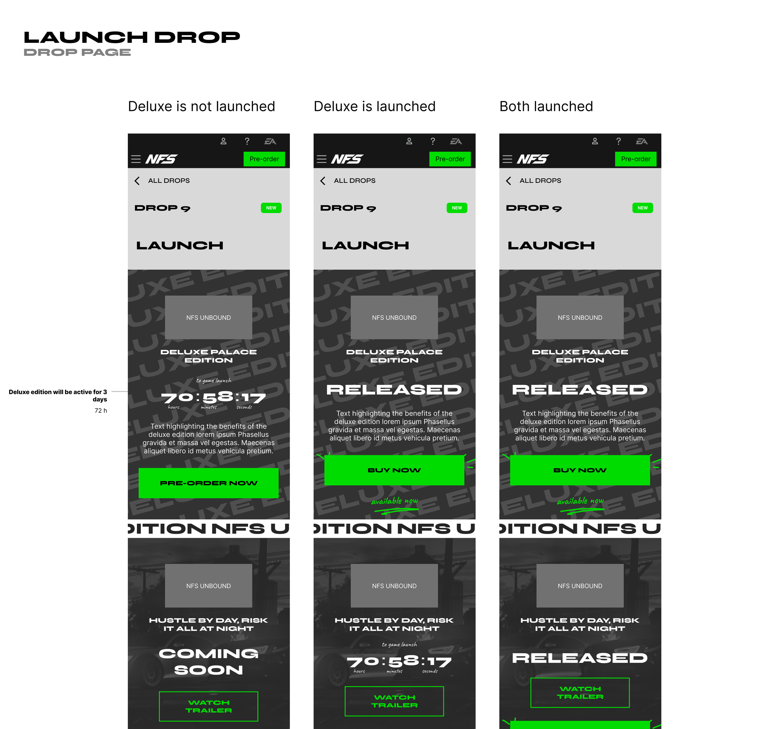
■ Drop 9 - Launch
Focused on countdowns towards the launch and summary of the campaign.
Visual Design
■
■
■ ■
The visual design for the project was executed by the talented designers at North Kingdom, namely Jonas and Ludvig. During the initial stages, I was responsible for overseeing part of the production process to ensure that the designs were aligned with the UX requirements. However, once my colleague returned from their vacation, they took over and finalized the designs. I have tremendous respect for the work done by both the visual designers and my colleague, and I am proud to have been a part of such a great team.
UX Design Need for Speed
UX Design Need for Speed
Traffic during campaign
■
■
■ ■
The campaign yielded impressive results in terms of website traffic across the whole campaign. Throughout its duration, the site attracted an impressive number of visitors, with 191,000 unique players exploring the content. Additionally, the campaign generated significant engagement, with a total of 452,000 page views recorded. These numbers demonstrate the campaign's effectiveness in driving traffic and capturing the interest of a substantial audience in the sphere of content creation and hip sop culture.
Watch a short video on how YouTube creators reacted to the the Unbound Need For Speed Platform.
Case studies
☻
Case studies ☻
Flavourit App. Democratising wine tasting
UX Design | App Design
Designing for impact: helping women with daily discomfort
UX Design | UX Research | Strategy | App Design


