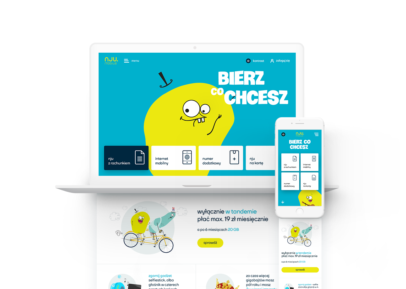
E-commerce simple offer presentation
Overview
Overview
Redesign of a new portal njumobile.com - one of the biggest Polish telecom companies owned by Orange.
I was assigned to this project after Hycom (company I worked for) won a contest to create a full website based on their proposal. The proposal was giving a strong direction of visual style of the website. My task was to develop the rest of the pages with the support of the art director and me directing and leading the junior designer helping out in the process.
Team
Part 1/ Working strongly with the art director to develop key screens for the dev team.
Part 2/ Working with the dev team directly.
UI Designer (me), UX Designer and Developers Team of 3.
Role
UI Designer
Tools
Photoshop
Duration
3-4 months
Company
Hycom
Responsibilities
Designing pages and illustrations in RWD as the main project designer (mobile, tablet, desktop). I was answering to the Art Director and at the same time was including him at key stages of the process. Worked together closely with developers to create an amazing experience for each resolution.
Process & Timeline
Double Diamond Framework
Problem
The main problems of the previous website were:
01 | Complicated offer presentation
02 | Slow loading
03 | Visually cramped messages
Goals we wanted to achieve:
01 | Simple design
02 | Fast loading
03 | Clear offer presentation
04 | Few step quick sell
05 | Mobile first experience
Old Home Page - Nju Mobile
Areas of focus
Project stage
After assigning me to this project - the key screens of the website were already approved as a concept by the client. Screens that were reviewed by the client included: Home Page, General overview of the offer for both desktop and mobile. My task was to develop the rest of the pages and implement the missing parts based on the wireframes created by my fellow colleagues from the UX team.
To fully understand the concept of the UI/UX redesign it’s important to see a clear inspiration taken from the cashpoint interface presented on the image on the left.
Working with dev team
Nju brand was using the main character in the tv commercials and marketing materials with a sense of humor. The yellow looking character would often have funny adventures that would promote new offers.
Considering the role of the yellow character we decided that interactions on the website should express the nature of the character, the brand and in the same way promote how unique they are.
During the design process I was responsible for directing the development of key interactions:
01 |
Eyes of the character following the action of the user’s cursor on home page. Which was a key interaction welcoming users on the website. From a technical point of view it was important to test all the possible screen sizes for desktop and cut the ones that were least likely to be used to fit into the budget.
02 |
Presenting the offers while hovering over the key buttons. From a technical point of view it was important to design “templates” for each offer that would have specific positioning of typography in context of the illustration so the client could use those templates in the future instead of interfering with the design integrity.
03 |
I was responsible for visual and animation/interaction consistency across the website.
Illustrations
During the design process my task was as well to design propositions of illustrations that would convince the client and help them visualize the project in real life.
Final Design
Outcome
Personal reflection
As a Junior UI Designer that was my first project where I could perform on a bigger scale and I was very excited to do so. During this time I had a chance as well for the first time to work in cross-functional team with my colleagues from other teams like UX Designers, Front & Back Development and as well first client meetings.
This opportunity gave me a lot of confidence and as well a big learning lesson how to work in cross-functional team and how to be a great asset to it. Being communicative and supportive to my colleagues was an important part of it.
Facts after the redesign:
2nd fastest telecom website in Poland
first chat bot to sell mobile contracts
built on design system
31% increased conversion rates
Finding flight deals App
UX Design | App Design
Expressing classical music through website
UX Design | Web Design


